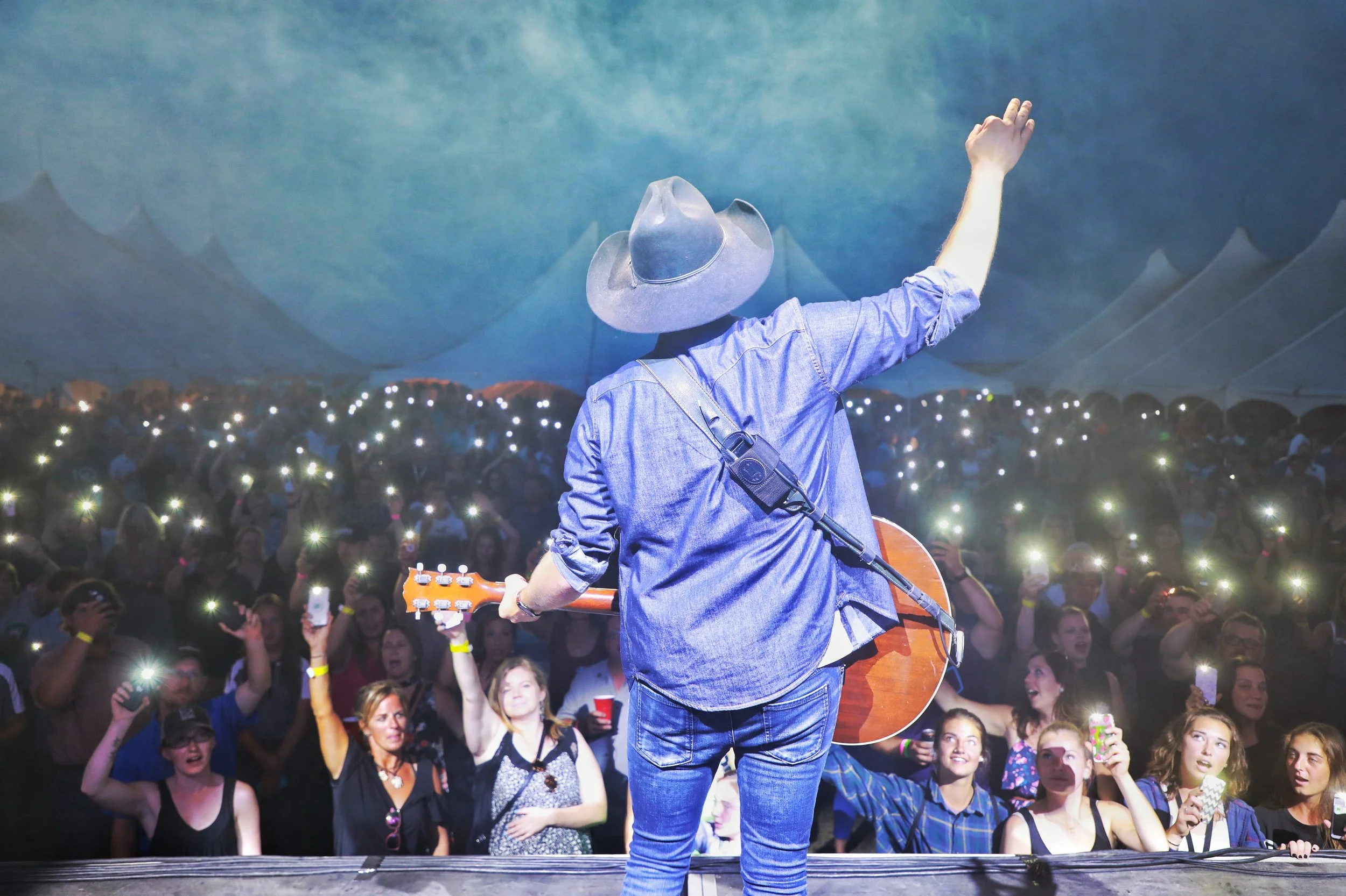
Farm Boy Productions
SECTOR - PHOTOGRAPHY | FILM | VIDEO EDITING
SERVICES - Brand Strategy, Graphic design, Marketing Support, Content Writing
THE REQUEST
Craft a rebrand that feels personal yet is industry aligned
Tell a brand story that conveys strong industry capabiliities
Build brand assets with consistency
Create a cohesive design aesthetic
Incoporate client’s own photography
Design marketing collateral connects
Amplify emotional connection to the brand
THE REQUEST
FBP approached us with a clear need for transformation. Their previous identity—centered around a cowboy boot—had served them well in earlier stages of the organization’s growth. But as their mission, audience, and impact expanded, the visual language no longer reflected who they were or the bold direction they were heading.
They were ready to move beyond a literal, western-inspired symbol toward a brand that felt inclusive and strategically aligned with their future. The goal was to create a refreshed identity that captured their evolving purpose and expressed their rallying call: Let’s Be Bold Together.
THE RESULTS
We began by clarifying FBP’s core values, desired perception, and long-term vision—quickly identifying that the cowboy-boot symbol no longer reflected the organization’s sense of progress, unity, or momentum.
The redesigned identity steps confidently into a new era. We replaced the literal western imagery with a modern, flexible system built on clean geometry, an energized yet professional colour palette, and contemporary typography that brings clarity and consistency across all applications. Anchored by the rallying tagline “Let’s Be Bold Together,” the refreshed brand now communicates collaboration, confidence, and forward movement. With a comprehensive brand style guide in place, FBP now has the tools to apply the identity cohesively—ensuring the brand feels strong, credible, and current in every context.
The result is a thoughtful and transformative redesign: one that honours where FBP has been, but clearly signals where they are headed. Confident, modern, and purpose-driven, the new brand positions FBP for greater visibility, deeper engagement, and a bold new chapter of growth.
WHAT THEY’RE SAYING…
“About five years ago, I was referred to Terri as an expert in food branding and design, and I knew immediately I wanted her on our team at Sargent family Dairy. More reently, I asked her to help rebrand my own business. The process was a lot of fun — we strategized around what I wanted the new logo to represent and explored several creative directions. The final brand is clean, modern, and meaningful, and I could not be happier with the result. I would highly recommend working with Terri.”
~ Bruce Sargent, Owner, Farm Boy Productions