Riverside Natural Foods
SECTOR - All Natural Snacks, Breakfast Foods, Cereals, Crackers
SERVICES - Brand Strategy, Package Design, Design Systems, Design Architecture, Visual Identity
Build brand consistency
Align multiple product segments
Simplify the design approach
Create a cohesive design system
Create a cohesive, easy-to-follow colour system
Make the product the hero
Increase shelf presence
Grow consumer awareness across retailers
Amplify emotional connection to the brand
PROJECT GOALS
THE REQUEST
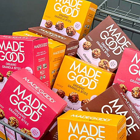
Rooted in the belief that better-for-you snacking should still spark joy, MADEGOOD® required an evolved packaging system with a bold new visual approach. The need to craft a consistent design architecture across an expansive lineup—from granola bars to bites to star-crackers to cereal and more— allows the brand to strengthen its shelf presence while creating a sense of trust and familiarity for returning consumers.
THE RESULTS
The updated design confidently embraces an inviting colour palette paired with playful product imagery that reflects both fun and functionality. The prominent MADEGOOD® wordmark remains a central unifier, while each segment’s unique palette allows consumers to shop the range with ease. The new system I develop is cohesive, and built to scale. Reinforcing MadeGood®’s values of warmth, inclusivity + better-for-you snacking. Dramatically improving clarity for consumers and efficiency for internal teams.
By doubling down on brand consistency and visual storytelling, MADEGOOD® is re-engaging loyal fans, while welcoming new ones, into a world where food values meet feel-good snacking. This packaging evolution isn’t just about looking fresh—it’s about amplifying consumer connection and carving out an even more memorable place in this better-for-you and the planet category. Every detail reinforces MADEGOOD®’s promise: organic, allergen-friendly snacks that don’t compromise on flavour or delight.

WHAT THEY’RE SAYING…
“Okay, so YOU are responsible for this awesome upgrade on design? I have to let you know that when I spotted them at Costco for the first time with the new packaging, I was impressed. They really stood out and caught my eye. I thought it was a whole new product! SO well done!” ~ insta@costgoer